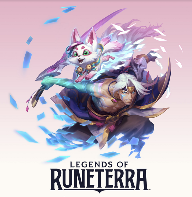
Spirit Blossom is Riot’s first in-game event to span multiple games, allowing players to explore Spirit Blossom in both League of Legends and Legends of Runeterra. But before we dive into how that happened, let’s take a look at what Spirit Blossom is.
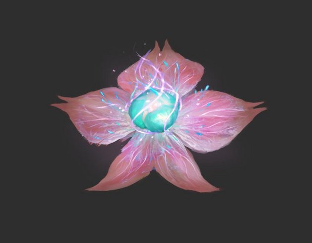
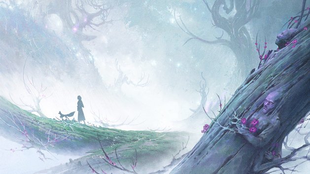
Spirit Blossom is an in-lore (meaning canon League of Legends IP) event that signals the blossoming of an actual(-ly fictional) spirit blossom flower in Ionia. Ionians use the flower’s intrinsic spiritual properties to commune with their deceased loved ones and either celebrate their peaceful passing into the afterlife, or mourn their inability to rest.
But League and LoR are two very different games—one’s a MOBA and the other a CCG. They have different aesthetics and players, so how exactly do we ensure that players have a cohesive experience across both games?
Visual Design Has Entered the Chat
Visual design at Riot is split into two key areas: Designers who work on products, creating individual assets like icons, boards, and user interfaces within our games, and designers who work on brand and publishing assets, ensuring that players understand exactly what they’re getting before they get in game.
We’ll hear how visual designers from both of these areas work together to ensure consistent design language and style across different games.
So let’s start at the beginning: Discovering the visual brand for Spirit Blossom.
Creating Spirit Blossom’s Visual Identity
With League of Legends Visual Designer Craig “Riot MrParkinson” Parkinson
I began by asking the thematic development team—who are the artists, writers, and producers tasked with creating League’s multiverse—what exactly Spirit Blossom was. And as they told me about the thematic there were a few key words they repeated, like whimsical, spiritual, elegant, peaceful, abstract, and beguiling. So I compiled those words in a document and just... started from there.
Spirit Blossom focuses on the afterlife, and the spirits that reside within. They’re inherently interconnected in the spirit realm and live in relative peace. I used that as my north star, so to speak, as I got to work pulling visual references and creating mood boards that evoked those feelings.
Then I broke the references down into the key areas I needed to explore and looked at the shape language, color, and texture. This helped me decide the direction I wanted to take Spirit Blossom’s brand. But I had to ask myself how we would bring all the pieces together—mainly the key inspirations of anime, East Asian mythology, and League—and make them feel cohesive.
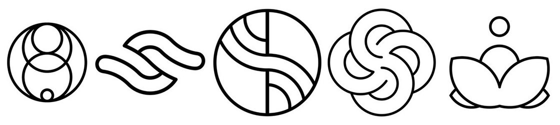
Shape Language
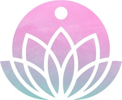
I wanted to capture the event’s elegance with its unique shape language. It needed to be something abstract and soft, while still feeling fresh and unfamiliar. Using that as my guide, I started to explore the types of shapes I was looking for.
Geometry jumped out to me almost instantly. I could use these elegant shapes to build a sort of symbolism to reference different things within the Spirit Blossom festival. It really lent itself well to the overall thematic because geometry’s intention is really up to what the viewer sees in it. It can mean lots of different things and nothing at the same time.
I used reference images from East Asian art like floral shapes, swirls, and clouds. And as I was iterating on this and thinking about how it would fit in the UI, it felt like something was missing: A deeper tie-in to the work that the thematic development team was doing. What if I could use the concept art for the skins within the design itself?
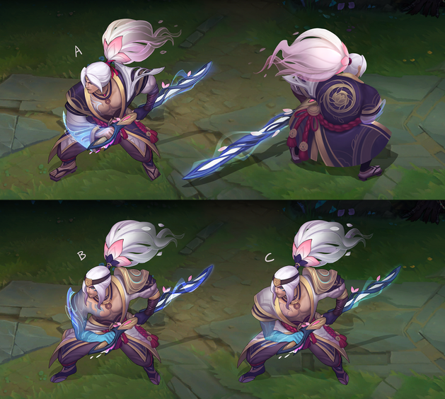
I wanted to keep it grounded in what players could see and interact with in-game, so I added them as sort of framing components. The geometry I was going for became the folklore patterns you see on Yasuo’s shirt. Using that as the foundation, I thought about how these distinctive folklore patterns and shapes could support the brand elements. And that’s what led me to the next part: color and texture.
Color and Texture
The thematic development team created a beautiful color palette for the event that was heavily based on watercolors. Everything was meant to feel very whimsical and dream-like. As I looked at watercolor paintings for reference I couldn’t help but notice the distinct textures they had—even just the way the ink drops onto a piece of parchment.
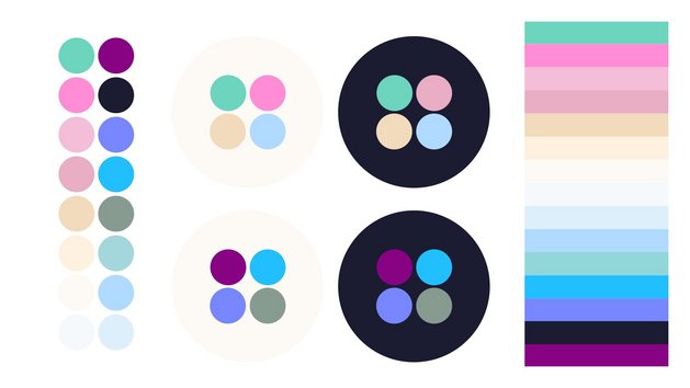
I wanted to keep the visual design tied into the skins so it feels like everything ties in together. But I still needed some unique textures to ensure that not everything felt like flat color. I used things like tree bark, brush strokes, or even the veins within a leaf as inspiration, and from there I sort of had a small vertical slice of the event’s visual design.
After all of this initial discovery—and an emphatic yes from the team—I kind of went into crazy mode. I must’ve designed about 90 logos or something. It was rather crazy. And each time I presented and got more feedback, I’d narrow it down until we got to where we are today.
Once everything was decided on and set, I created a guide that I then gave to the rest of the teams working on the event. And that’s what the Legends of Runeterra team used to get started.
Bringing the Blossom to LoR
With Legends of Runeterra Senior Visual Designer Tom “Riot Tomukus” Sayer
I work on the design and implementation of assets within Legends of Runeterra. What that means is I work with user experience designers, engineers, concept artists, writers—basically all of the LoR team—to ensure players have something to look at and interact with in our game.
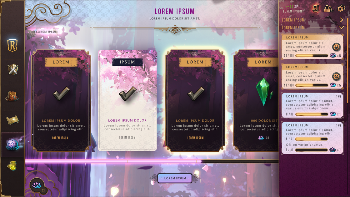
My work really begins when we get a wireframe from the UX designers. That’s basically a set of grey, black, and white boxes that gives us an idea of where each piece we need to create goes. Then it’s my job to rearrange those things and decide the hierarchy of each individual element—essentially which things are in the background or the foreground. And this is based off of the information that’s most important to players.
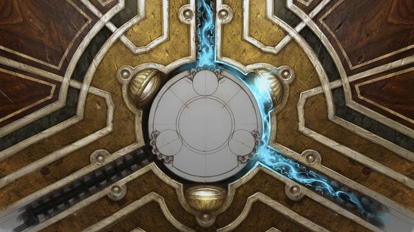
When we were designing the client space for Spirit Blossom we decided on a tracker so players could see their progress as they earned rewards. It functions similarly to Region Rewards, which lets players select a region and earn progress towards it. Visual design needed to pull all of this information in to ensure that Spirit Blossom’s tracker looked visually consistent with the style League made, and that it looked different from Region Rewards.
To do that, I looked at the assets and visual design guidelines Riot MrParkinson prepared for us and translated them into a format that made sense for LoR. Even though League and LoR are within the same IP (and from the same company) they have unique styles for art and visual design. League’s client is a modern, flat UI—there’s some dimension and flourish added in certain places, but it’s different from LoR’s, where we took a more skeuomorphic approach.
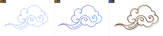
Skeuomorphic design feels sort of real. If you think back to the original smartphones, their app design was really realistic. Notepads actually had the texture of paper, and the font they used when typing on it looked similar to taking notes with pen or pencil. This was because people weren’t super familiar with how to take notes on a touchscreen. We took the same approach with LoR—to immerse players in the world of Runeterra. Everything you interact with should feel like it’s a physical object. So when it came to applying the Spirit Blossom visual design, we needed to tweak it a little bit to fit LoR. This can be seen everywhere in the UI, but the easiest example is the cloud.
When Riot MrParkinson gave us the visual guidelines, I noticed they included clouds as an element of inspiration. They’re sort of East Asian styled, which works well for LoR because they’re both heavily stylized. They have a lot of swirls and are generally quite soft-looking. But in order to make them work in our client, I needed to add texture and make the cloud more metallic, because that’s the general style we use.
When I started on the cloud I pulled up references, which meant opening Adobe Illustrator, pasting visual references from Riot MrParkinson on the artboard, and then drawing. I knew I wanted it to be metal and bulkier, which meant that instead of tracing the reference I drew it on my own.
I personally start by drawing in Illustrator because it gives me a clean vector. Then I can stroke the lines to make them thicker or thinner. After that I import it into Photoshop as a shape.
Once the vector is in Photoshop I use layer styles like bevel and emboss, add gradient overlays and strokes, and create inner/outer drop shadows and glows. Once I find exactly what I’m looking for, I drop those layer styles onto the vector of the cloud.
I finished the layer style by adding a drop shadow because I wanted the cloud to be in the foreground, and for it to feel as though it was floating on top of the background.
And then I paint.
I added little flairs of light and some areas of shadow. And then, to ensure it didn’t feel like a flat piece of metal pasted on top of the client, I added some dark lines so it’d appear to bend towards the player.
Once I was happy I shared it with the team. And then I did it again for every other asset for the event. There were about 40 in total. It’s important that we make every asset feel like they’re handcrafted—because they are!
I just hope that any players who log into League and then log into LoR (or the other way around) see what we’ve created and instantly recognize it as the same event. Then that means we’ve done our jobs well and gave players for both of these games a good and cohesive experience.